


Flex Box (CSS)
Creating Flexible Layouts with Flexbox: A Guide to the CSS Flexbox Module


Flexbox is a popular CSS layout module that allows web developers to create flexible and responsive layouts for their websites. With flexbox, you can easily control the alignment, spacing, and distribution of elements on a web page.
To start using flexbox, you need to define a container element and set its "display" property to "flex". This makes the container a flex container and enables the use of flexbox properties to control the layout of its child elements. Here's an example of how to create a simple flex container:
.container {
  display: flex;
}
Once you have defined a flex container, you can use several flexbox properties to control the layout of its child elements. Let's explore some of the most useful flexbox properties with some code snippets.
Justify Content:
The "justify-content" property controls how the child elements are distributed along the main axis (horizontal axis). Here are some examples of how to use "justify-content":
.container {
  justify-content: flex-end; /* Aligns items to the right */
}
Before flex-end:

After flex-end:

.container {
  justify-content: center; /* Centers items */
}
Before Center:

After Center:

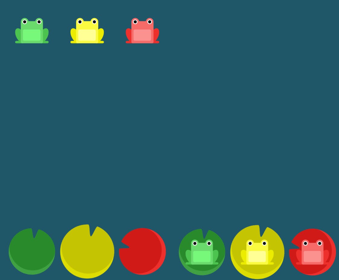
.container {
  justify-content: space-between; /* Distributes items evenly with space
between them */
}
Before space-between:

After space-between:

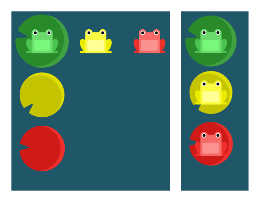
Align Items:
The "align-items" property controls how the child elements are aligned along the cross-axis (vertical axis). Here are some examples of how to use "align-items":
.container {
  align-items: flex-end; /* Aligns items to the bottom */
}
Before and After flex-end:
Similarly there are properties like center, stretch etc.,
.container {
  align-items: center; /* Centers items vertically */
}
.container {
  align-items: stretch; /* Stretches items to fill the container height */
}
Flex Direction:
The "flex-direction" property controls the direction in which the child elements are laid out. By default, it's set to "row", which arranges the elements horizontally. Here are some examples of how to use "flex-direction":
.container {
  flex-direction: row-reverse; /* Reverses the order of items horizontally */
}
Before row-reverse:

After row-reverse:

.container {
  flex-direction: column; /* Arranges items vertically */
}
Before and After column:
Flex Grow:
The "flex-grow" property controls how much space the child elements should take up. Here's an example of how to use "flex-grow":
.item {
  flex-grow: 1; /* The item will grow to fill any available space */
}
Flex Shrink:
The "flex-shrink" property controls how much the child elements should shrink if there's not enough space. Here's an example of how to use "flex-shrink":
.item {
  flex-shrink: 1; /* The item will shrink to fit the available space */
}
These are just a few examples of the many properties available in flexbox. By mastering these basic properties, you can create complex and flexible layouts for your web pages. With flexbox, you can easily control the alignment, spacing, and distribution of elements on a web page, making it an essential tool for modern web design.